BLOG
What is a PQ curve and how do you read it?
In the quest for the perfect system of your dreams there is an immovable object in your way known as the real world. It isn’t uncommon to spend hours and hours looking at theoretical performance, potential temperatures, and expected airflow even before buying parts. But theory often excludes many variables. One of the ways we can better understand performance is by looking at a PQ curve. Let’s learn what it is and how it can help us better understand how our PC might perform under different use cases.
What is a PQ Curve?
The ‘P’ and ‘Q’ simply come from the variable commonly used for pressure and airflow in engineering. A PQ curve is a measure of a fan’s static pressure and airflow through its operating capacity. It’s a measure of the real world effects so it is not as smooth as the perfect fan curves we make to control the power or RPM of fans. It’s a more complicated graph that reflects all the complexities of how a fan is designed, if you’re using it with a radiator, or if you’re running it at different speeds. By using one we can get a more detailed look at a fan’s performance in different situations.

How do you read a PQ curve?
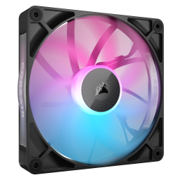
At first glance a PQ curve can look like a confusingly complicated graph. Let’s first take a look at the parts of the graph to break down the different pieces of information being shown. We’ll be using the PQ curve from our new RX120 fans as an example for this article.
First let’s go over the legend and see what we’re trying to model. Along the top we can see that there are various PWMs that an RX120 can run at as well as a line for a radiator. For now, let’s just focus on the fans. Along the vertical axis we see static pressure and on the horizontal axis we see airflow. Each line shows the range of possibilities at a fixed PWM. There is always a downward sloping trend to reflect the trade off between static pressure and airflow. For a more understanding of that correlation, check our article on static pressure vs airflow.
Data points along the horizontal axis represent the airflow without any static pressure, meaning that the pathway is completely unrestricted and there is nothing stopping the air from moving forward. On the other hand, points along vertical axis have no airflow, meaning they are a measure of pressure in a completely blocked airway. This explains why lower PWMs are more clustered to the bottom left of the graph. Naturally, a slower fan will be able to produce less airflow and less static pressure.


Pressure Axis
maximum pressure with no airflow with full impedance
Airflow Axis
maximum airflow with no pressure with no impedance
But by looking at the changes in the graph, we can better understand how the performance changes at different conditions. A taller more vertical slope between data points shows how static pressure would need to change drastically to change airflow. A flatter more horizontal slope is an indicator that the pressure could be slightly lower while providing more airflow.


Big Slope Change
big reduction in pressure for more airflow
Small Slope Change
small reduction in pressure for more airflow
We can also look at the space between the lines to learn about the performance. The bigger the gap between the lines, the bigger the change. If we just focus on the points along the vertical axis for static pressure, we can see how the change from 20% PWM to 40% PWM is smaller than the change from 40% PWM to 60% PWM. This is an indicator of how the performance output of the fan is not a linear correlation to the power input of the fan.


20% PWM to 40% PWM
small change in pressure
40% PWM to 60% PWM
bigger change in pressure

Real World Performance
Now let’s turn our attention to that radiator, the Hydro X XR5. This is going to require a step back to understand what it is representing. While the RX120 fans are showing the potential range of pressure and airflow outputs, the XR5 radiator is showing a required input for the radiator’s operation. In other words, since the radiator will be impeding the airflow from the fans, you need to have enough pressure to use it.
This is where the graph turns into tangible real world performance. We have the theoretical performance of the fans and the fixed real world impedance of the radiator. Now we can figure out the actual performance of the fans. Visually, we can see this by looking at where the PWM curves meet the radiator’s impedance. By matching the pressure of the fans to the impedance of the radiator we can look at the fan’s airflow to understand how much performance we’re getting at certain speeds. We can look at the fan’s performance at different PWMs to get an idea of how the performance changes as the fan runs faster.

XR5 Radiator Intersects With PWM
intersections show real world performance
That’s the in-depth guide on how to read PQ curves. But even this is still relatively simple. It’s not hard to find PQ curves overlayed with even more lines for power or sound. It just goes to show how complex fans alone can be and how many different factors can go into a decision. For the best performance in both static pressure and airflow check out the new RX120, the latest fan to join our iCUE LINK ecosystem.
A CIKKBEN SZEREPLŐ TERMÉKEK
